4. Deep dive on measuring IT emissions with more granularity
Recap of previous lessons
In the first two lessons, we introduced the concept of Sustainable IT Monitoring, some basics of the electricity grids, and relevant grid signals. We also discussed key considerations when selecting them and challenges associated with sourcing them. In the last lesson, we introduced the Sustainable IT Monitoring journey. It begins with measuring IT emissions with higher granularity, continues with the addition of further insights, and then leverages real-time data. Automated load-shifting represents the last step of this journey.
Access last week’s lesson here for more details on the different steps of a Sustainable IT Monitoring journey.
Today, we will take a deep dive into the first two steps of this journey: measuring IT emissions with higher granularity and adding more grid signals to derive further insights.
In Today’s lesson
The start of your Sustainable IT Monitoring journey
The first steps of Sustainable IT Monitoring build the knowledge foundation that serves as for all the next steps. These steps are not only crucial to better understand your IT usage, emissions, or costs, but also prepare your ability to manage and reduce them down the line.
The starting point is to gain visibility, and there are two ways to explore: increase the granularity of the signals you use and measurements you make, or increase the number of signals and data you keep track of. We will dive deeper into each of these in the sections below. Increasing the granularity not only brings challenges for gathering granular grid data but also challenges for gathering granular usage data. The former has already been covered in the first lessons of this course, and the latter will be explored further in the coming section.

Measure emissions with higher granularity
Measuring emissions with higher granularity is challenging in numerous ways. First, IT practitioners must know the right methodology to account for IT emissions. Once the methodology is known, we have to tackle the challenge of gathering the necessary data. This includes granular grid data, but first and foremost, granular usage data. The following three sections provide more details to help you approach each of these challenges.
Methodologies for accounting emissions
The best place to start, if you are unsure about how to measure emissions with higher granularity, is to review existing guidance and regulations to ensure compliance with them. Regarding what grid data to use, we already covered important regulations in Lesson 2, including the Greenhouse Gas Protocol Scope 2 Guidance (1) and SBTi Corporate Targets (2). Ideally, the same type of guidance would exist for measuring emissions from IT. Unfortunately, that’s not yet the case.
Some industry working groups, though, are emerging to develop guidelines on how to measure and reduce emissions from IT. One of them is the Green Software Foundation (3) which aims to build standards, tooling, and best practices for green software. Among the resources they developed, the Software Carbon Intensity (SCI) Specification indicates how to calculate the rate of carbon emissions for a software system, accounting for both embodied and operational emissions.
The Green Software Foundation is working on adapting the SCI specification for specific use cases such as AI or web applications. They are also progressing on methodologies for calculating the emissions of hardware (4).

(Formula detailing the SCI Specification from Green Software Foundation)
Gather Usage Data
Energy usage data is the cornerstone of all methodologies for assessing IT-related emissions. Yet obtaining it can often be one of the most challenging steps. This section provides practical guidance on how to collect, compare, and estimate this data effectively.
Provider Tools and Methodological Differences
Many IT service providers now include energy and emissions information as part of their offerings. However, these data sets vary in detail, scope, and methodology, making comparison difficult across providers.
Google Cloud and AWS both support carbon footprint features: Google Cloud’s Carbon Footprint (5) and AWS Customer Carbon Footprint Tool (6). However, their respective methodologies can significantly differ. Since this summer, the AWS tool now includes location-based emissions for the energy usage, instead of market-based emissions only. The market-based approach allows companies to account for renewable energy certificates, often used to claim 100% renewable energy. In that sense, it does not reflect the electricity actually consumed from the grid and the associated carbon emissions. The location-based approach accounts for emissions of electricity directly consumed from the local grid and provides a deeper understanding of what electricity sources are consumed and how to reduce electricity emissions. Even though both tools now provide location-based emissions, which allow a more meaningful comparison, their methodologies are still not aligned. Google Cloud uses hourly emissions factors while AWS uses yearly emissions factors.
The lack of consistency in methodology between providers makes it challenging for organizations to harmonize their emissions accounting. Understanding these methodological differences is therefore essential before aggregating or comparing data from multiple sources.
Open Source and Vendor-Agnostic Tools
To overcome inconsistencies between providers, open-source and vendor-agnostic tools can be valuable alternatives. These solutions help organizations gather and compare energy usage data in a standardized manner, regardless of cloud or infrastructure provider.
Following the above example of cloud emissions, Cloud Carbon Footprint (7) is one such tool that enables monitoring and reduction of emissions across major cloud platforms, including AWS, Google Cloud, and Microsoft Azure. It provides a unified view of energy consumption across providers.
Another helpful tool is Kepler (8) (Kubernetes Efficient Power Level Exporter), which measures energy consumption at the container, pod, virtual machine, and process levels. It gathers data directly from hardware sensors and attributes energy use according to resource utilization, offering a deep understanding of workloads’ energy consumption.
The Boavizta (9) is another important initiative. It brings together organizations working on methods and open resources to evaluate the environmental impact of digital activities. Its datasets and tools, available under free licenses, support energy measurement and emissions estimation across a variety of IT contexts.
Using these open and collaborative resources allows organizations to maintain transparency and enhance comparability, independent of specific vendors.
Estimating Energy Use with Load Profiles
In some cases, detailed or granular energy usage data may not be directly available. In such situations, estimations based on load profiles can serve as a practical alternative. A load profile represents how electricity consumption changes over time—for instance, between day and night, or between weekdays and weekends.
Consider an example where the monthly electricity consumption of an IT system is known to be 50 MWh, but hourly data is not available. If we know that the system load is roughly 50% higher* during daytime compared to nighttime, we can construct a load profile that reflects this pattern. This indicative load profile can also be repeated over 30 days to represent a full month. This yields the load profiles in the figures below. Refer to the end of this page for more details about how we built them.
*Please note that the 50% figure is indicative, and this figure depends on the type of equipment we're measuring, and a lot of different other variables within the same type of IT infrastructure. Try to find a realistic number for your equipment from any available meters or internal specialists to your organization.
Two graphs one after the other: First, a charted daily load profile where the peak is 50% higher than the trough. The second image shows the same profile over 30 days.
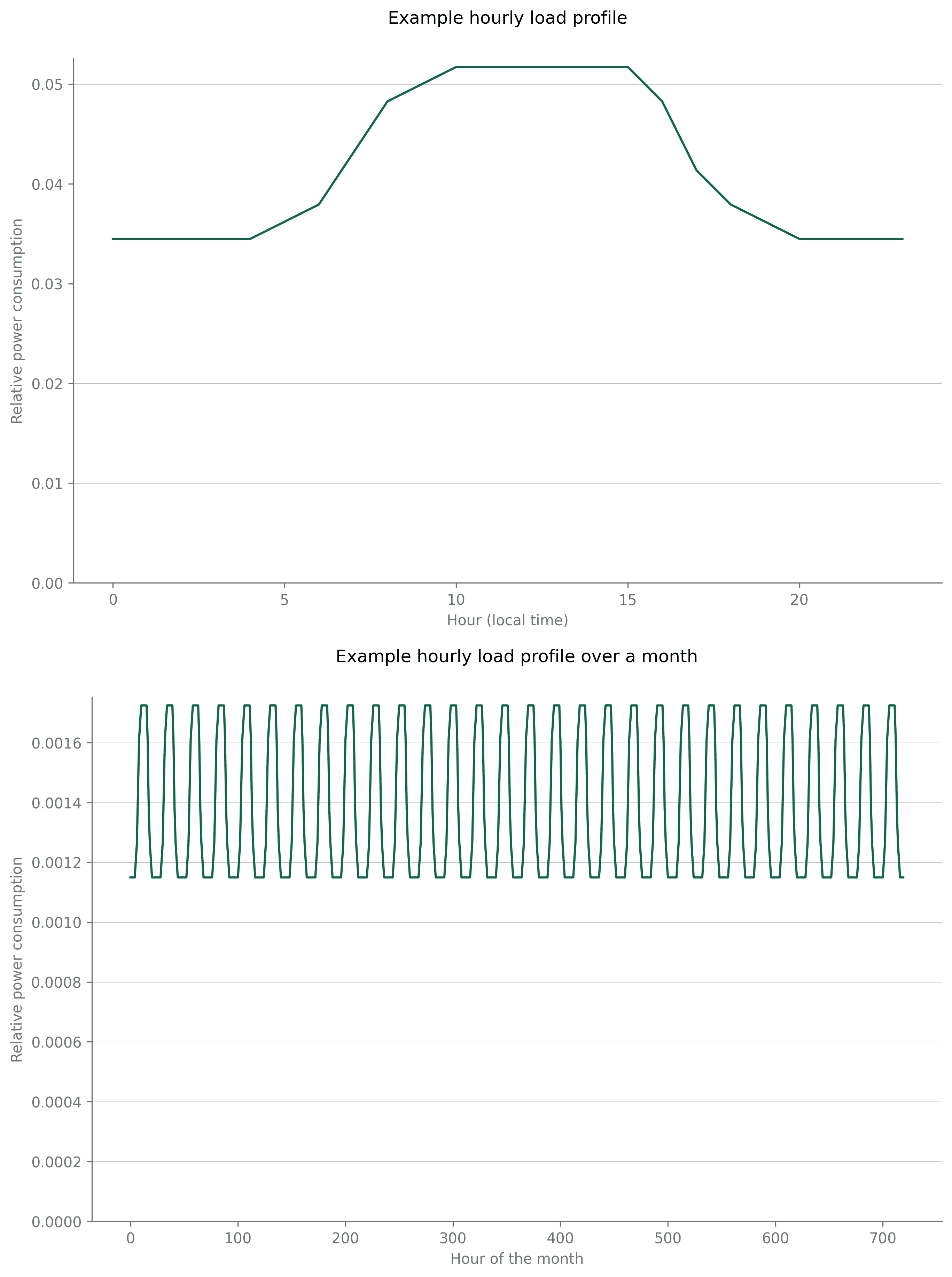
Now, if we multiply the load profile by the monthly total consumption - 50 MWh in our case here - we get the hourly electricity load over the entire month. While this method offers only an approximation, it gives a much more realistic representation of actual electricity load than a single aggregate figure used without any specific profile. Over time, the load profile can be refined further to include seasonal variations, differences between weekdays and weekends, or other known consumption behaviors specific to your organization.

(Graph comparing a static average profile with a constructured profile, and what the actual profile might look like.)
Gathering reliable energy usage data requires navigating differing methodologies among providers, complementing these with open-source measurement tools, and developing estimation techniques when direct data is unavailable. Combining these approaches allows organizations to build a more complete and actionable understanding of their IT energy footprint. This understanding forms the foundation for effective monitoring and meaningful reduction of emissions over time.
Gather granular grid data
Once gathered at a granular level, energy usage data must be combined with granular grid data to derive as many insights as possible from historical IT usage. Lessons 2 and 3 already covered at large the importance of granularity for grid data, and we refer to these lessons for more details.

Add more signals to derive further insights
Lessons 1 and 2 introduced several grid signals that exist besides the flow-traced carbon intensity, such as market electricity prices, electricity load (also called electricity demand), the flow-traced electricity mix, or flow-traced renewable energy and carbon-free energy percentages.
Explore on your own!
As a refresher, you can explore these different signals on our live and free Map. You can click on layers at the bottom right of the screen to switch between electricity signals and visualize the map according to the signal of your choice. The left panel that opens up when clicking on a country also includes graphs of all signals.
Our Live Map
All these signals can prove relevant in your Sustainable IT Monitoring journey to gain further insights about:
Why emissions are increasing/decreasing, and how to better manage these fluctuations
Where to simultaneously leverage costs and emissions reductions
How to support the grid balancing while optimizing your operations
These signals are significantly correlated with each other while at the same time telling different stories. This means times of low emissions will often mean times of low prices, but that is not always the case. Also, this depends on one grid to another. Because these signals are (imperfectly) correlated, there is a significant potential for identifying simultaneous costs and emissions reductions while helping with grid balancing by leveraging all available grid signals.
Another reason for leveraging more signals is to create a better understanding of the grid’s behaviour, and thus be more prepared to anticipate future fluctuations. Electricity mix data is key to explaining the fluctuations of grid dispatch and how this translates into carbon intensity variations. By creating a more solid understanding of these dynamics, your customers and your teams can create best practices that lead to emissions and cost savings.
For example, in California, carbon intensity tends to be lower during the middle of the day with significant solar generation. Running workloads in the middle of the day, when solar generation is high, in California, is thus a good practice. In Ontario, carbon intensity tends to be lower at night with lower gas generation and a clean baseload of nuclear and hydro. Running workloads at night, when gas generation is low, in Ontario, is thus a good practice.
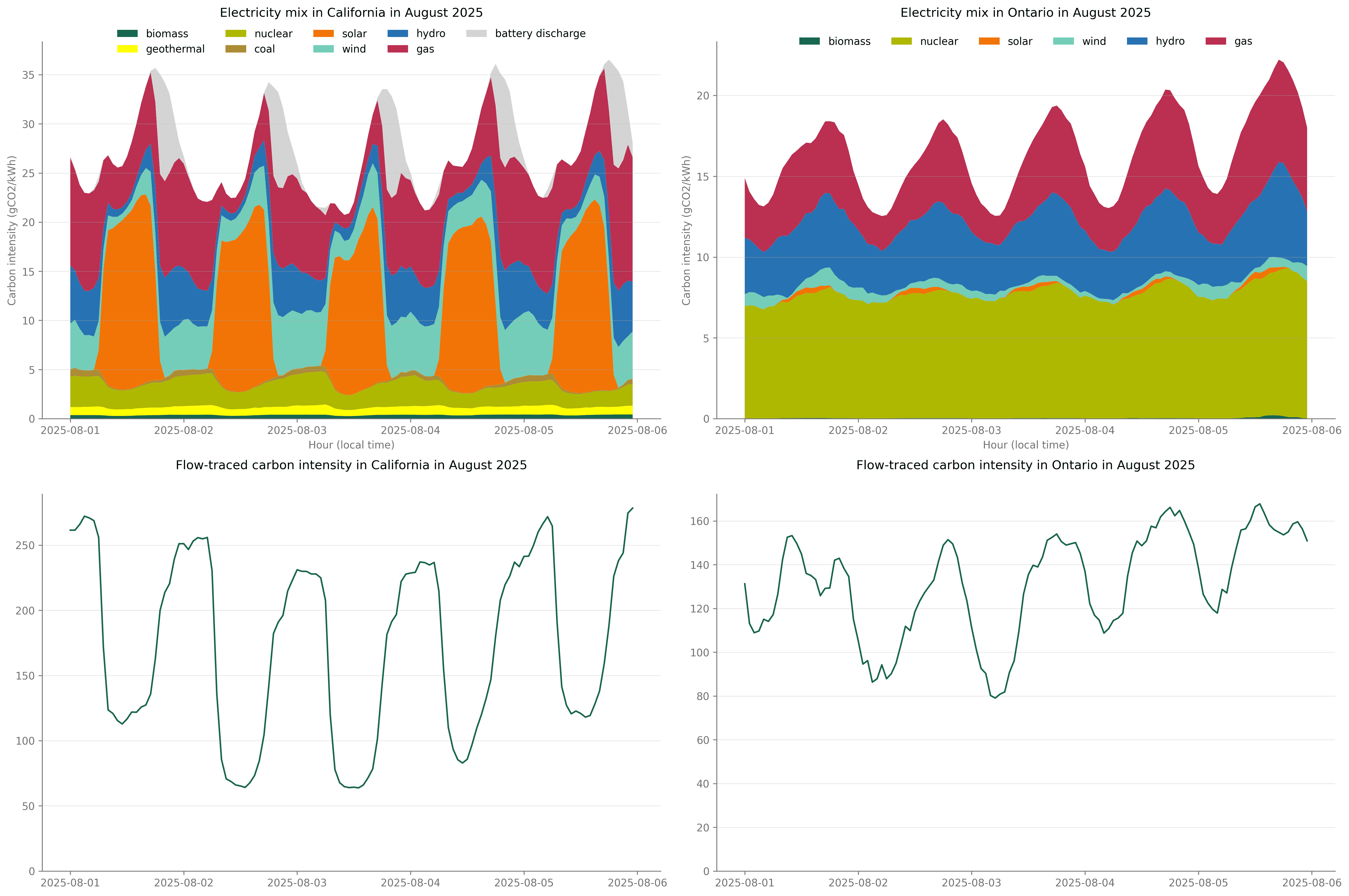
(Electricity Mix and Carbon Intensity in California, and Ontario, comparatively)
Adding granularity is not the only way to improve the visibility of IT emissions; it can also grow by sourcing further insights from the addition of new signals. This enables a more holistic approach and understanding of the IT usage, which increases the awareness gained and the potential for creating best practices to reduce costs and emissions.
Additional details on the load profiles
In this course, we introduced load profiles as a tool to estimate energy usage with greater precision when only aggregated numbers - such as monthly consumption - are available. We provide more details in this section on how we built the one used in our example.
In this example, we want to reflect an IT load that is roughly 50% higher during daytime compared to nighttime and build profiles for one day and for a full month. We start with a base value of 100, which will be the electricity consumption at night. We know that electricity consumption will be at 150 during the day (as per our initial assumption). We assume that the system will take 6 hours to ramp up to its full load, and 5 hours to ramp down in the evening, and we fill intermediate values during these hours, which leads to the following values (column Load step 1):
Hour | Load Step 1 | Load profile |
0 | 100 | 0.0345 |
1 | 100 | 0.0345 |
2 | 100 | 0.0345 |
3 | 100 | 0.0345 |
4 | 100 | 0.0345 |
5 | 105 | 0.0362 |
6 | 110 | 0.0379 |
7 | 125 | 0.0431 |
8 | 140 | 0.0483 |
9 | 145 | 0.0500 |
10 | 150 | 0.0517 |
11 | 150 | 0.0517 |
12 | 150 | 0.0517 |
13 | 150 | 0.0517 |
14 | 150 | 0.0517 |
15 | 150 | 0.0517 |
16 | 140 | 0.0483 |
17 | 120 | 0.0414 |
18 | 110 | 0.0379 |
19 | 105 | 0.0362 |
20 | 100 | 0.0345 |
21 | 100 | 0.0345 |
22 | 100 | 0.0345 |
23 | 100 | 0.0345 |
What you will learn in next week’s lesson
We introduced in Lesson 3 the maturity journey of Sustainable IT Monitoring. It starts with measuring IT emissions with higher granularity, continues with adding further insights, and then leverages real-time data. Automated load-shifting represents the last step of this journey.
Today, we covered the first two steps of this maturity journey. In next week’s lesson, we will dive into how leveraging real-time data provides additional benefits in terms of emissions and cost reductions.
We've left some references below 👇 And if you found this useful (or not, but read it anyway), please spare a minute to help us improve the course going forward: 1-min survey
References: