Updates

Product releases & company news

Read the latest news and check out which events you can meet us at.

Latest

Data Quality

Product

News

Product

:

Map

Improvement

Global coverage: Real-time electricity grid data for 110+ additional countries

Electricity Maps has expanded its coverage to accelerate global decarbonization efforts — now delivering real-time carbon intensity and energy mix data for over 200 countries and territories through its API and app.

Increased coverage

We’ve released granular electricity data for over 110 additional countries and territories to the Electricity Maps platform, allowing us to provide almost complete coverage for Canada, the African continent, South America, and other highly requested regions such as North Korea and Greenland. In total, Electricity Maps now collects, processes and distributes grid insight for over 200 countries and territories around the world.

The coverage expansion is made possible with our newly deployed General Purpose Zone Development model. The data for these new zones includes hourly, daily, monthly, and yearly carbon intensity metrics for electricity consumption as well as production, calculated using our advanced flow-tracing engine. By incorporating a wide range of weather data, we can deliver actionable real-time carbon intensity estimates for each region.

Current coverage for these countries spans up to 2023, with plans to expand historical data availability to 2017 in the coming weeks. Soon-to-be-released updates will provide coverage for China, Mexico, Indonesia, Vietnam, and Hong Kong.

Why global coverage matters

This expansion of Electricity Maps unlocks previously inaccessible electricity data, driving greater transparency into global electricity grids and supporting crucial decarbonization efforts. 

Large, globally dispersed companies, such as leading tech companies running energy-intensive data centers, have a significant role to play in decarbonizing our global electricity grids. Based on our close relationships with such partners like Google, Microsoft and Samsung, we understand the importance of having access to global standardized electricity data to drive their ambitious emissions reduction efforts. 

Already today, global enterprises benefit from using our API to:   

  • Report global Scope 2 emissions in line with leading standards, such as the GHG protocol and SBTi criteria

  • Monitor and accelerate their progress toward net-zero sustainability goals

  • Analyze global electricity grids to inform strategic decisions to reduce their emissions

  • Enable their customers around the world to measure and report Scope 3 emissions related to product use, such as global IT infrastructure

This extended coverage also unlocks opportunities for local businesses that previously lacked access to granular electricity insights for their regions. Global decarbonization depends on actions across the globe — from companies like Monta reducing emissions at European EV charge points to IT manufacturers in Asia optimizing energy-intensive production or renewable energy developers in Africa.

Moreover, providing global historical and real-time carbon intensity and energy mix insights in our free Electricity Maps app allows users to understand electricity emissions from their local grid to the farthest corners of the world — whether they are energy experts, heads of state or curious individuals. 

Methodology: Overcoming data limitations with advanced machine learning

Our latest release of grid zones tackles the critical challenge of limited data availability. Many regions report only yearly electricity production figures, making it difficult to derive the detailed hourly insights needed for effective analysis. Using advanced machine-learning and real-time weather data, we are now able to estimate hourly electricity production in regions where only yearly data is available. 


A high-level view of our General Purpose Zone Development model


We can summarize the complexities of the General Purpose Development Model in the following steps: First, monthly electricity production is estimated for each energy source by analyzing seasonal patterns, informed by temperature, precipitation, and solar radiation data. Next, the data is refined into hourly production figures, ensuring alignment with the zone’s annual totals while reflecting local weather-driven trends. Our proprietary flow-tracing pipeline then calculates grid consumption data, accounting for imports, exports, and grid complexity. Despite the data limitations, this model ensures the highest possible accuracy, ensuring the total electricity produced each hour matches the zone's yearly electricity production data.

Read more about the methodology of the General Purpose Zone Development model here.

Product

:

Models

New release

New 72-hour grid forecasts: Advanced load optimization for greater carbon and cost savings

We are excited to announce the latest feature addition to Electricity Maps’ API: 72-hour grid forecasts for flow-traced carbon intensity, renewable energy share (RE%), and power mix signals are now available for 100+ zones on the API.


Advantages of forecasting 72 hours ahead

This new forecasting capability empowers Electricity Maps’ users to optimize for even greater emissions reductions and electricity cost savings. The ability to anticipate upcoming electricity trends across several days allows businesses to more efficiently shift operations to times when renewable energy is more abundant or when carbon intensity is at its lowest. For example, in Germany, shifting loads from the worst (high-carbon intensity) to the best (low-carbon intensity) hour over 72 hours unlocks 59% of carbon savings (compared to 44% for 24 hours). In Texas 72-hour optimization can save 50% (compared to 39% over a 24-hour horizon). These periods of low-carbon electricity often correlate with lower electricity prices.

Key advantages of this release include:

  • Improved load optimization: With a longer forecasting horizon, companies can shift energy loads over a greater time span (e.g. over the weekend), providing more opportunities for optimization and higher potential emissions and cost reductions.

  • Better products for your customers: Build advanced features that unlock customer value by allowing your end-users to optimize their electricity consumption across multiple days, such as over the weekend.

  • Faster progress to net-zero: Improved emissions reductions can accelerate companies’ progress toward their sustainability goals.

  • Global reliable data: Quality-guaranteed forecasts offer consistency and accuracy across the globe.

Who can benefit from 72-hour forecasts?

The new release brings significant value to our clients in a variety of industries. Specifically:

  • Enterprises and tech companies with large IT infrastructure can more efficiently shift their computing workloads to run on cleaner electricity, significantly reducing emissions.

  • EV manufacturers and CPOs can help their customers optimize EV charging for lower carbon footprints and reduced costs. 

  • Smart home or connected devices providers can enable users to save more carbon and cost by optimizing the use and charge of such devices by planning days ahead.

How could this look like in practice? 

With the new 72-hour forecasts, users can optimize electricity use for both costs and emissions over several days, such as in the case of EV charging. For example, starting December 11th, 2024, Northern Europe experienced a "Dunkelflaute," where a lack of wind and solar generation led to a significant increase in electricity prices, peaking at 936€/MWh on December 12th.

By using 72-hour grid forecasts, carbon-intelligent EV software could have predicted this spike in electricity price and emissions and enabled EV owners to adjust their charging schedule. As the wind started blowing again after the Dunkelflaute, electricity prices decreased from 936€/MWh to 40€/MWh and carbon intensity fell by 70% within 72 hours in Germany. By intelligently shifting their EV’s electricity use, they would not only have saved significant costs but also reduced emissions by avoiding high-carbon intensity periods. 

Highest quality standards

At Electricity Maps, we are committed to providing highly accurate and reliable forecasts. We closely monitor and continuously improve our forecast quality. All our grid forecasts are validated and come with a guarantee of quality*. For example, our renewable energy share forecasts come with an error below 10%. 

Want to take advantage of our extended forecasts for better load optimization? We're excited to work with you and share our expertise.

* Forecast quality is being monitored on all available forecast horizons, including the 72h forecasts. SLAs are currently only available for 24h and 48h forecasts. Contact us for further details.

News

Electricity Maps raises €5M to scale its global impact

We’re very excited to announce that we just closed a financing round of €5M led by climate funds Transition and Revent.

Are you a journalist? Find our press release, press kit and additional resources for your coverage here.

How we got here

Electricity Maps had been mostly bootstrapped since its inception in 2016, which meant we only scaled and hired when revenue allowed us to. Even with these limited resources, we ended up doubling our revenue every year, while growing our app to millions of yearly visitors, and having our commercial API serve close to 10 million daily requests. However, the increased scrutiny of our data has left users and customers asking for more. Until now, we’ve struggled to answer that demand, given that we had limited ability to hire and scale. This changes today.‍

Why now

The year 2023 was the warmest year since global records began in 1850, being 1.2°C above the 20th century average, breaking the previous record set in 2016 when Electricity Maps was founded. Most of this is attributed to human-induced emissions of greenhouse gasses, where most are CO2 from the energy sector.

Image

Driven by the urgent need to get rid of all fossil fuels, the world is in the midst of the most profound transformation in humankind's history. It will require large-scale electrification and a supply of fossil-free electricity, available every second of the year.

On one hand, the amount of renewables on the grid is exploding (it’s the cheapest way to supply electricity when the sun shines and the wind blows). On the other hand, we’re electrifying all energy usages, driven by the need to depart from fossil-fuel-based transportation, heating and industrial systems.

Fortunately, most of the new electricity demand is flexible, meaning their usage can be shifted to times where electricity is cheaper and cleaner (see our previous work with heat pumps, electric vehicles, data centers and home appliances).

Matching an increasing electricity demand with a growing intermittent energy supply will require interacting with the grid in real-time using data APIs. Furthermore, greenwashing has become a significant risk which could slow down the energy transition. Therefore, we have set ourselves the mission to enable a data-driven decarbonisation of electricity.

This additional financing round will enable us to accelerate delivering on this mission, where we will map the world’s electricity grids in even more detail, extending our app and API to include many more relevant signals. This endeavor will require the brightest minds to join us.

Want to partner with us? Reach out here.

Interested in joining the adventure? Explore all open positions here.

Data Quality

Increasing the precision of our data using regional emission factors

Today, we’re launching a new improvement to Electricity Maps which will improve the precision of our carbon emission data. We call this improvement regional emission factors.

What are emission factors?

An emission factor corresponds to the amount of greenhouse gasses released in the atmosphere  from the production of a single unit of electricity by a specific power plant. Renewable technologies tend to have a low emission factor (typically lower than 50 gCO₂eq/kWh), whereas fossil fuel power plants tend to have a high emission factor (typically higher than 400 gCO₂eq/kWh). Multiplying an emission factor by the amount of electricity consumed results in the total amount of greenhouse gasses emitted.

Emission factor of a power plant (gCO2eq/kWh)

Emission factors used on the Electricity Maps App take into account the whole life-cycle of the power plants. Thus, emissions resulting from the extraction of resources required to build the power plant, emissions from its operations, and its end-of-life, all need to be accounted for. Our commercial API includes both life-cycle and direct emission factors.

We previously used emission factors from the 2014 IPCC Fifth Assessment Report, which aggregates emission factors estimated by a multitude of peer-reviewed studies. These emission factors depend on the type of power plant, but stay the same irrespective of the location.

However, the emission factor of a power plant depends on multiple factors. The quality of the fuel used will impact the factor. For example, lignite power plants have higher emission factors than hard coal power plants as lignite has a lower carbon content. The efficiency and the technology of the power plant also need to be considered. In the case of a combined heat and power (CHP) plant, heat is recovered from electricity production and used for heat production, significantly increasing the efficiency of the plant compared to separate electricity and heat installations. Less fuel is burned and consequently, total emissions are reduced. As a result, emissions from electricity generation in a CHP plant are lower than a conventional thermal power plant.

All of this means that there’s an opportunity to increase the precision of emission factors, especially as newer and more granular data sources appeared in the meantime.

Improved emission factors in the US

The US Environment Protection Agency publishes the Emissions & Generation Resource Integrated Database (eGRID) every year. The eGRID data includes generation, emissions among other attributes for almost all power plants on the US territory. The dataset is available here.

Data explorer for the eGrid dataset. Each dot represents a power plant reporting greenhouse gas emissions.

To compute regional emission factors for the US, more than 5000 power plants in the eGRID dataset were matched to the corresponding Electricity Maps zone. Emission factors for each plant in a given zone are then aggregated to create the emissions factors per power plant type and per zone.

In the example below, we can see that resulting biomass emission factors vary greatly depending on the location. In the US, reported emissions from biomass depend on the type of combustible burned. Some combustible types are considered as carbon-free, while others are not. Consequently, the emissions reported vary greatly between power plants (see eGRID2020 Technical guide section 3.1.2.1).

Biomass emission factors computed for US zones

Improved emission factors in Europe

The European Commission publishes verified emissions and allocations for all power plants that are part of the EU emissions trading scheme (EU-ETS). This dataset is updated on an annual basis and is available here. Furthermore, ENTSO-E publishes generation information per power plant for the majority of European countries. Generation per unit is available on the ENTSO-E Transparency Platform here.

Crossing these two datasets enables us to determine the emission factors of each power plant. 

The emission factor of a type of power plant in a given Electricity Maps zone is obtained by aggregating the emission factors of all power plants located in that zone. As an example, when considering gas power plants, we see quite a diverse set of emission factors depending on the country. As explained above, emission factors depend on the technology of the power plant. This explains the difference in distribution between Romania and Italy. In Italy, the average gas emission factor is lower and the distribution of factors is smaller as there are more CHP plants. On the other hand, the large variance in Romania suggests that gas installations only produce electricity and are less efficient.  

Gas emission factors computed for EU zones

In conclusion

The methodology to compute these figures is completely transparent and will be continuously updated on our wiki. Anyone is encouraged to contribute to it in order to help us publish the most accurate and up to date information. The resulting emission factors are open source, and can be accessed here. They are also accessible directly on our App.

This new methodology will impact carbon intensities in the US and Europe in the following ways.

  • For fossil fuels, the average calculated emission factors are significantly higher than the IPCC 2014 factors.

  • In both the US and the EU, coal emission factors are more than 25% higher than the IPCC 2014 value.

  • Oil emission factors are more than 60% higher using regional emission factors.

  • Solar emission factors are computed depending on the location, emphasizing how different the impact of solar production can be in different zones. 

We continuously improve our methodology to ensure the highest level of data accuracy. Adding the regional emission factors helps us reach that goal. This will also allow us to have a better understanding of a zone’s electricity sector as well as its actual contribution to global electricity emissions.

Acknowledgments

We would like to thank Mirko Schäfer for his insights on the EU-ETS data and for his help on the methodology.

We’d also like to thank Thomas Gibon for helping Electricity Maps identify some of these key data sources as well as Dave Jones and Ember for reviewing the methodology.

This work was supported by a grant from the Google.org foundation.


News

Becoming Electricity Maps

The genesis

It was around the beginning of 2016 that we started becoming obsessed with how data could act as a catalyst to put humanity back on a sustainable path. Climate change is a major issue, which was at the time completely ignored by the tech industry in general, and by entrepreneurs in particular.

If any "founders" out there want to "disrupt" our 401 ppm atmospheric CO2, or "moonshot" ocean acidification, that would be cool

Bret Victor

As we know, climate change is predominantly caused by fossil fuels being burned for energy. A key piece of the solution is to electrify the world, but what good is it if we still use electricity produced with fossil fuels?

In a world that is increasingly becoming electric, there is a need to organise and make accessible the carbon footprint of electricity consumed. As wind and solar production fluctuates throughout the day, this information needs to be dynamic and updated in real-time. As this information will be scrutinized and challenged by many parties, the effort has to be collaborative, open and transparent. This is what motivated the creation of Electricity Map, which started out as a very simple real-time data visualisation in June 2016.

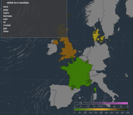
This is the first version of Electricity Map (June, 2016)

First version of Electricity Map (8th of June 2016)

Fast forward to 2022, and the Electricity Map project now has had 3500+ contributions and has become now the most popular open source #climatechange project on github. The app is seen by millions every year, used by heads of states and policy makers while being regularly cited on TV, radio and in the written press. It is used in classrooms and at universities around the world, and enables some of the most heated debates of the energy transition on social media. We’re so proud to see that it enables global awareness of a topic that was too often previously reserved to experts.

Our free API has enabled community initiatives such as the integration with Home Assistant, where tens of thousands of people now observe their own electricity footprint, or with xbar, where macOS users track how green their electricity is from the status bar of their computer.

The amount and quality of contributions is both astonishing and humbling. We now cover more than 60+ countries while the granularity is continuously being increased as going beyond countries to reach 150+ zones. This would never have been possible without our community which has dedicated countless hours to improve the app and scavenge hidden data feeds.

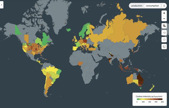
More than 150+ zones are now available, ranging from Latin America, Asia, India and Australia - all thanks to the community 🙏

But Electricity Map has become much more than an open source project: our own machine learning and algorithms has enabled us to become a sustainable business whose API is used by the world’s largest companies not only to measure and reduce their electricity footprint, but also to create new product offerings that enable their customers to do the same.

All of these great achievements have only been possible since we last year decided to shutdown our other climate products at Tomorrow in order to focus on decarbonising the power system (you can read about our lessons learned here, here and here).

We have always believed information precedes action — only when you know what is happening can you decide how to act. The world is going electric, and delivering clean electricity any time it is needed has become paramount. Our vision of success is simple: our work will be done the day clean electricity is supplied by all electricity grids of the world, at all times of the year. To get there, we will organise the world’s electricity information, and use it to drive the transition towards a truly decarbonised electricity system.

Our goal: a truly decarbonised electricity system. To get there, we will organise the world's electricity information, and use it to drive the transition towards a truly decarbonised electricity system.

Our goal: a truly decarbonised electricity system. To get there, we will organise the world's electricity information, and use it to drive the transition towards a truly decarbonised electricity system.


A new focus, and a new name. With that newly found ambition comes a new name. Today marks the next step of our evolution, as we’re now becoming Electricity Maps 🥳.

Why the plurality? Because this movement has become so much more than the live Map that it started out as. It has now grown into a company with a planetary impact and a sustainable business. As we engage with citizens, large corporations, policy makers, researchers but also hobbyists and open source contributors, the plurality of our approaches marks the next stage of our evolution. To that end, we will continue gather more data, at an increasing granularity, in order to accurately account for the footprint of all electricity consumed, and help any electricity consumer to drive the decarbonisation of the grid.

Our newly gained focus has enabled us to do so much more, and we plan to reveal many new things in the near future that will help the world reaching the goal of a truly decarbonised grid.

We hope you’ll join us on this exciting journey.

Interested in helping us? Join us here.